Calling your Website Visitors To Action, 101
Calling your Website Visitors To Action
A website is a website, but without a call to action, you risk losing marketshare. Or worse, if your goal is to sell, you risk missing your goal.
A call to action is anything that encourages visitors to act. Whether signing up for email updates, following your twitter feed, or forwarding to a friend, calls to action are key. Calls to action span into the political and non-profit world as well. Successful websites with purpose also ask for donations, letters to the editor, or general registration.
Following are some of the most effective methods, and associated tips for calling your visitors to action.
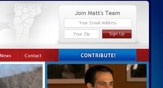
1. Social Media
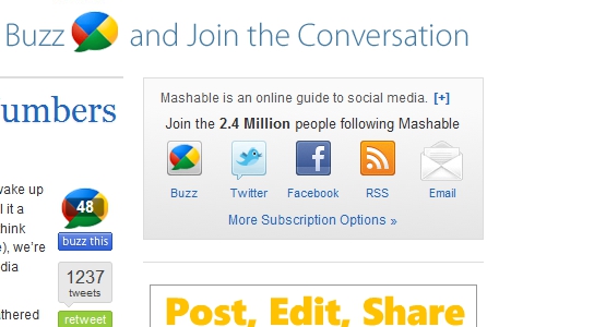
Email Updates
Remember to place the signup form prominently, above the fold. Also, the simpler the better when it comes to signing up. When calling visitors to action, don’t ask for their life story; a simple name and email address form is ideal.
Twitter
If people want to follow you on Twitter, they need to know how to find your information; consider placing above the fold, but it doesn’t need to be huge.
RSS
Most modern browsers offer a way to identify sites with RSS feeds, but it doesn’t hurt to offer an easy-to-find image linking to your feed. It can be handy to offer multiple feeds based on categories or tags. I am certainly more inclined to subscribe if I can compartmentalze and choose specific areas.
Related Content, Popular Posts, Most Commented, Etc.
I call these types of tactics "Content Wrap-rounds” because they link readers to another part of your site, thereby increasing time on the site, demonstrating the diversity of content, and increasing the likelihood of retention.
2. Web Site Design Tactics
Utilize Negative Space
Negative space is not necessarily white, but rather a space created by the absence of design elements. Use this space to your advantage. Placing calls to action within these spaces alone will encourage action.
Contrast Colors
Each quality website design has a color scheme. Choose a contrasting but thematic color from the scheme and use it to draw attention to various calls to action. If none of the colors in your scheme contrast signficantly from the rest, choose a new one that "goes” but easily draws attention.
Utilize Size
Larger elements attract the eye first, regardless of the reader’s intention. Pay attention to the size of your call to action and tweak as necessary. Some people say there is a ceiling in terms of size, I disagree. The size of your buttons should scale with the importance of the element.
Typography Matters
Choose typography carefully. This tool can be very helpful. As web browsers evolve, more fonts become "Web-friendly” and usable across platforms.
Follow the Eye
Consider where the eye will move naturally, and take advantage of this. Research shows people naturally read left-to-right, top-to-bottom. Also, the mouse pointer often starts at the top right of the screen. This political season, look for the most important button: the donate link. It will most often be located in the upper right area of the site.
Dimension
Dimension is very Web 2.0. Use things like dropshadows and overlaps to give dimension to elements. This brings focus to the particular element by giving the impression that it sits out from the page.
3. Social Bookmarking
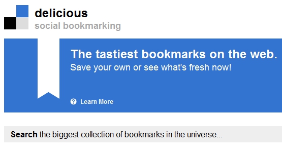
Digg, Stumbleupon, Reddit, Technorati, etc.
These sites are pivotal to spreading the word. Of course, no site is successful without quality content. Nor are any successful that aren’t read. See how these relate?
4. Mobilize, Activate
General Registration
This is a rarely utilized but powerful tactic for engaging and retaining visitors. Signing them up as "members” or whatever you may call it will allow you to provide access to various engagement techniques such as following you on Twitter, promoting your site to friends, even writing letters or making phone calls for your cause. Another tactic used by membership sites is sending sporadic emails encouraging users who haven’t visited in a while to visit again.
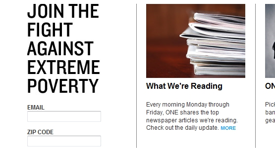
Contribute, Donate
Donate and contribute buttons are often utilized by political websites, and under-utilized by non-profits. Whether a simple Paypal donate button, or a complex payment gateway, donation buttons should be the most prominent button on your site. Unless, of course, you don’t need any money. More about design techniques below, but your donate button needs to have contrast, and to pop from the page.
Engage
Giving finite engagement requests like writing letters, making phone calls, donating, signup up for updates, etc., on the front page is key. Don’t rely on inside pages to engage people. If it’s important, put it right on front.
Schedule
What’s going on in your world? Is your candidate or cause going to be in my area? Utilize calendar widgets and other boxes to tell people about what’s happening right now. Don’t delay or rely on emails to your list.
Website Call-To-Action Wrap-Up
These points outline why and how a good website calls visitors to action. Every website should be doing it on some level, some more than most. Follow these guidelines and you’ll see increased conversions and effectiveness.
Guest Blogger: Cyrus Patten