Five AEC Firm Websites that Are Perfectly Mobile Responsive
Need Some Mobile Design Inspiration? Here Are Five Architecture, Engineering, and Construction Firm Websites that Look Stunning Across All Devices
The 2018 stats on mobile web usage are out, and—surprise surprise—they’re up again: Over 50% of web traffic now runs through mobile. This figure is insane when you consider the fact that five years ago it was hovering just above 15%.
At efelle, mobile responsivity has been our “default mode” for years. We also love working with clients in the architecture, engineering, and construction (AEC) sectors. In 2018 alone, we launched over 15 website design and development projects for companies operating in these industries.
There are tons of mobile-friendly things we do for all of our websites, and in a lot of cases, we go above and beyond basic best practices. The five AEC projects listed below fit squarely in this camp, so for your mobile-inspiration pleasure, we’ve listed out a few details for each that describe why these websites are so mobile-awesome.

- Large text. The text sizes across the site work perfectly on desktop and mobile alike. It’s like the Goldilocks of font choices: not so big that it takes up the whole screen, and not so small that it’s unreadable on smaller devices. Web accessibility nerds would be proud.
- Easy-to-use sliders. Image and text content sliders across the site come fully equipped with large arrows that users can easily click or touch when browsing—because we know there’s nothing more frustrating than a linked object that’s so small, it requires perfect thumb-pad accuracy to activate.
- Nested menu items. We don’t typically recommend loading navigation menus with a ton of nested items (these usually show up in the form of “drop-down” items when viewing websites on desktop), but Andersen Construction came to us with a lot of content to wrangle—especially for their portfolio. Featuring nested menu items that can be explored on mobile using well-sized side arrows within the hamburger menu makes navigating to all areas of the site a cinch.

- Scroll animations. Oftentimes, features that make a website stand out from the crowd on desktop don’t scale down well to a mobile setting. This isn’t the case with Synergy—especially in relation to their homepage. From the moving pixel grid in the masthead area to the grey content block borders that “draw themselves” on scroll to the self-counting statistics toward the bottom of the page, there is no sacrifice on either style or page-load speed regardless of device.
- Easy-to-operate galleries. We’re not going to lie—Synergy’s portfolio pages are pretty sweet on desktop. They swap images on scroll, have expandable/collapsible info text blocks, and more. But they look beautiful on mobile, too. The mobile-specific layout gives both the image gallery and content areas enough breathing room to be effective in their own rights. Well-placed arrows make flipping through the project galleries a breeze and below-masthead navigation options make it simple to toggle between different projects or to head back to the portfolio overview page.
- A smartly scaled timeline. Synergy has won a ton of awards and recognitions—enough to earn them a dedicated “Awards” page. On desktop, Synergy’s impressive awards timeline takes up the full width of the screen. On mobile, it scales down beautifully thanks to intelligent design and development choices: The “active” content appears centered between only two other dates (instead of several), the image stacks below the bullet-point list area, and users have large, blue arrows available for toggling between dates, all of which maximizes viewable content while minimizing visual clutter within a single viewport.

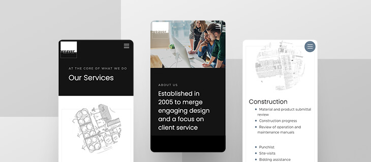
- Visible information blocks. Not all functionality on desktop carries through to mobile. This is especially true with hover effects. We designed and developed the Weaver site so that project listing information that appears on hover on desktop is instead, by default, visible on mobile. Better yet, the content doesn’t just stack—the mobile view has some of these elements overlap slightly, adding both visual interest and UI-friendly informational cues to the design.
- Scaled-back content. Though both desktop and mobile versions of Weaver’s website draw from the same content pool, the mobile version of Weaver’s site intelligently reduces some content in areas where it benefits the site to do so. For instance, the main navigation menu on desktop comes complete with graphical elements and imagery. Given the importance of simplicity and page-load speed on mobile, these images are absent when the site is viewed from a smaller device, instead replaced with a clean, simple hamburger menu that is both attractive and to-the-point. Likewise, the blog section on the homepage features only a single post instead of three, with the link off to more content available directly below the featured post. This decision allows the blog space on the homepage to remain free of clutter and entirely viewable within the size of a single screen, no excess scrolling necessary.
- Project filtration options. While it sometimes makes sense to scale back content on mobile in some areas, in others, it’s important to do what’s necessary to maintain certain functionality across devices while also respecting user experience. On mobile, the Weaver project overview page retains the filtration options found on the desktop site, stacking the drop-down menu options and sizing them appropriately so that they’re easy to use without taking up the whole screen.

- High-contrast colors and use of white space. Gateway’s primary brand colors are red and deep gray, both of which stand out nicely against a stark, white background. This juxtaposition is incorporated throughout the Gateway website, making it easy for users to read the content whether they’re browsing on mobile or desktop; this design choice is especially important given the amount on information the Gateway team has to share with its visitors.
- Attractive sans-serif fonts. As with high-contrast colors, sans-serif fonts make for easier reading on smaller digital devices. Design choices like these ensure that the website’s user experience is as strong on a smartphone as it is on a laptop.
- Downloadable project PDFs. Providing users with the opportunity to view their projects in PDF form takes Gateway’s web offerings one step further: Users can download these PDFs onto their smartphones to enjoy even when they’re offline, removing both device and connectivity barriers. This is especially important considering that many of Gateway’s website users are likely to be found at remote job sites where there is a higher likelihood of connectivity issues occurring (compared to the average office setting).

- Animated features. Barghausen’s mobile homepage is as eye-grabbing as the desktop version thanks to careful retention of some of key animation effects. For one, the “self-typing” text feature in the masthead works just as well inside a smaller frame as it does on a full screen.
- Above-the-fold self-scroll buttons. Several of the themes for the Barghausen website feature “self-scroll” buttons in the masthead area that users can activate in order to be taken to an anchored spot further down the page. An attractive feature on desktop, this is even more useful on a smartphone, as mobile users don’t always have a full range of motion with their thumb for scrolling; in some circumstances, tapping is easier than swiping in order to get where you want to go.
- Goldilocks-sized content blocks. Returning to the concept of design elements that are “just the right size,” the mobile styling for Barghausen’s site doesn’t just stack content and call it a day—it’s uniquely developed so that many content sections throughout the site fill the viewport with little-to-no overflow. For instance, when viewing the homepage’s projects block on mobile, you can see the top of the project image, introductory project copy, slider buttons to navigate to other projects, and the “View Portfolio” CTA all in one space—there is no visual clutter from other sections and everything is accessible. This helps focus the user and gives clear visual cues as to where they’re at in the page’s narrative (the footer menu is another great example of a full viewport content block).
Wanting to Improve Your Website’s Mobile Responsivity? You’ve Come to the Right Place
At efelle creative, we’ve been designing and developing websites since 2005. We have our finger on the pulse of the latest in web trends and recognize the importance of keeping up with the Joneses—not just from an aesthetic standpoint, but from an SEO and functionality standpoint, as well. Your website should look good, load quickly, and be easy to find and fun to use across all devices. If you think you’re losing out on leads thanks to poor mobile responsivity, we can help. Call us today at 206.384.4909 or reach out via our online contact form.