Five Rebrands that Make All the Difference
Rebrands Can Give New Life to Any Company’s Online Marketing Efforts
The fast-paced nature of modern society can make it challenging to keep up with changes in design trends and technology. Branding that served a company well for years may start to look dated.
Trying to keep up with the Joneses may sound exhausting, but companies that are willing to rebrand now and then—and put time and focus into rebranding well—can get ahead in their highly competitive markets.
Here are a few recent rebrands that we’re loving.
Uber Eats
Uber Eats recently simplified their branding, making it bolder and stronger in the process. Before the rebrand, they used a small, thin type that wasn’t very scalable; the new look shows more confidence.

Uber Eats also moved away from the fork icon in their previous logo, instead focusing on a seamless incorporation of the ‘Uber’ brand into a new logo. One of the primary reasons for this? Uber Eats is now in 65 countries now; by eliminating the fork icon and focusing just on the name of the company, they can appeal to a more global audience—after all, not all cultures use forks when eating.
Simplifying the logo also means the Uber Eats website can now incorporate fun geometric imagery that may have looked less sharp and “on brand” next to the soft lines and styles of the previous logo.

To tie to all together, the use of ubiquitous Uber Eats green tones allows for a smooth transition from old branding to new without confusing longtime fans.
Taco Bell
Taco Bell’s previous logo and branding was likely recognizable to audiences all across North America. Still, as design trends change, the company saw fit to reassess their branding and change things up a bit.
They started with the logo: Their new logo is much more simplified and flexible, and while it keeps the same iconic bell graphic, it’s been revamped so that it can be used in many more applications—the Taco Bell team can now apply different colors, patterns, textures, etc. to the logo and bring it into a variety of different media with different themes.

The clean sans-serif font and new flat purple signature colors (removing the former bright colors and gradient) gives the restaurant a more upscale look that may appeal to a more established, experience-seeking audience.
But the logo itself isn’t the best part: The way the Taco Bell team uses it in their new branding efforts across social media is more impressive. The Taco Bell Instagram account is endless design inspiration; it’s well planned and full of variety—from bright, graphical patterns to flat lays to graphical collages and slow-mo videos, this account has it all.

Chobani
Chobani recently swapped out their logo for a rounder, more impactful model. The new font choice is both bold and soft with a unique sans-serif font. The Chobani logo also made the shift from all caps to normal case, giving the company’s branding a more friendly and approachable vibe.

In their social media marketing, Chobani is now opting for a natural-but-bright color story. Using photography inspired by the ‘60s and ‘70s, their imagery evokes a sense of nostalgia.

Zenefits
The recent Zenefits branding redesign shows a pretty big departure from the company’s previous assets. First, they replaced the folded paper bird in their logo with a sophisticated geometric ‘Z’ lettermark—this helps the company look more mature and established.

The Zenefits team also opted for a bolder color palette, giving strength to the branding that will help make it more recognizable and appear more trustworthy.
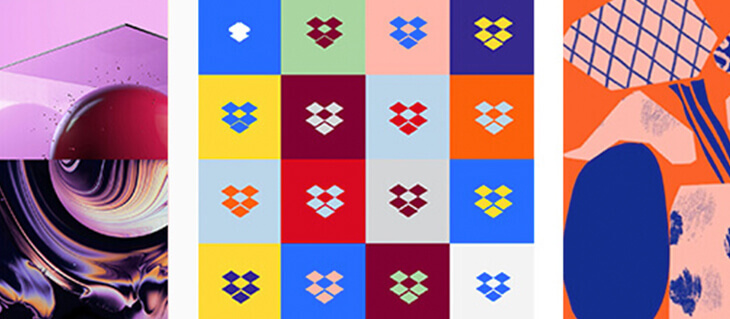
Dropbox
Dropbox’s recent rebrand included subtle changes to their logo. A new, bold color palette and unique contrasting color schemes make the brand stand out more than with their previous solid blue.

Their marketing is also undergoing some changes. The Dropbox team is transitioning its messaging from the focus on “what they do” to a new focus on what their users use dropbox for—storing creativity. This helps create a sense of personal connection between users and the Dropbox brand, as it implicitly expresses the company’s willingness to evolve with its user base—rather than trying to fit them into a box. (See what I did there?)

Looking to Add a Little Life to Your Company’s Online Presence with a Rebrand of Your Own?
efelle creative has been helping businesses revolutionize their digital marketing efforts since 2005. Our award-winning design team is hip to the latest in all things web and can help you re-establish your brand through a bold and eye-catching refresh. Call us today at 206.384.4909 or reach out online and let’s start up a conversation about how we can upgrade your online marketing efforts.